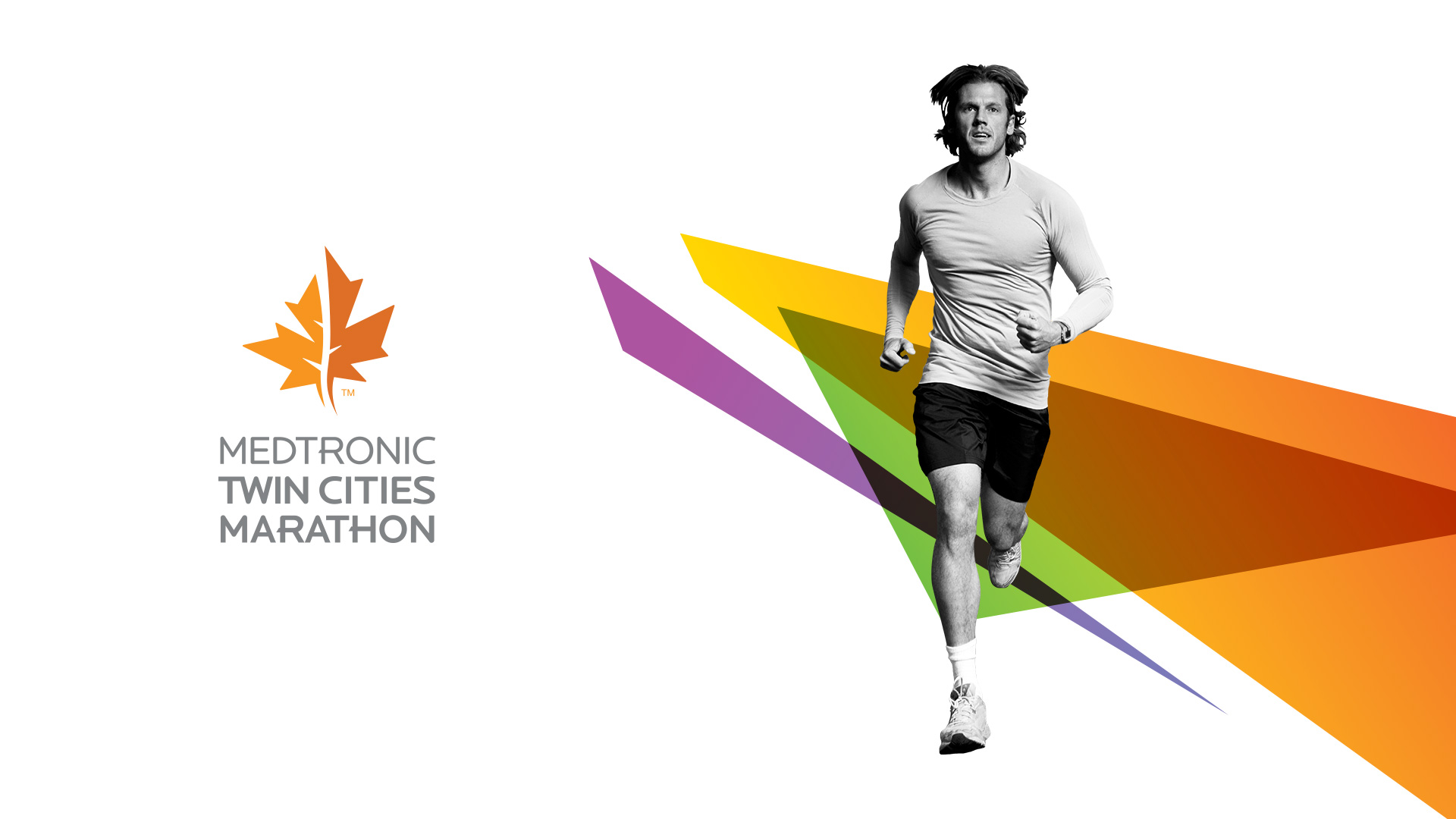
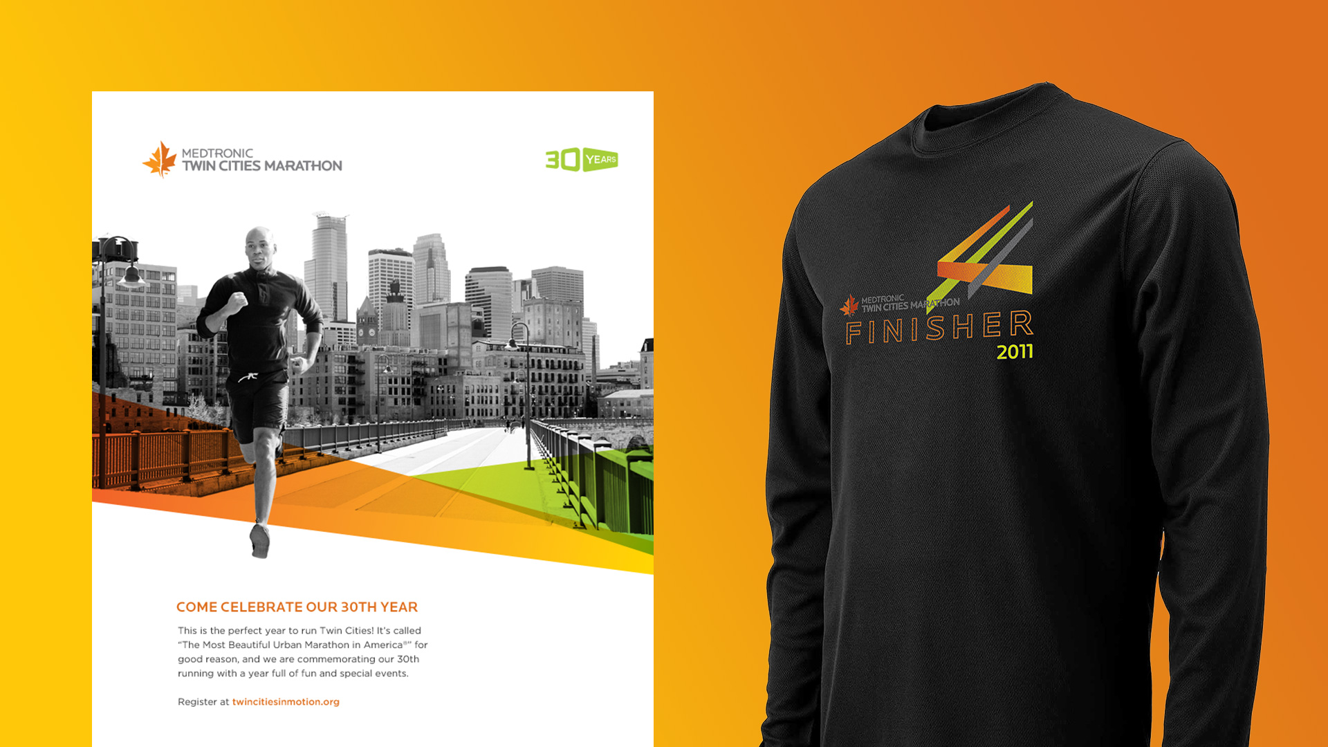
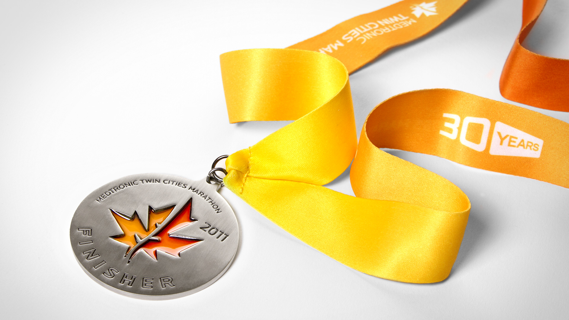
Dubbed “The Most Beautiful Urban Marathon in America,” the Twin Cities Marathon saw their 30 year anniversary as an opportune time to refresh their brand identity. The objective was to breathe new energy into the event and strengthen its perception among runners of other urban marathons around the nation. The new identity was designed as an homage to Charles S. Andersen’s original running man mark, and represents the Twin Cities (Minneapolis and St. Paul) joined together by the Mississippi River.
RESPONSIBLE FOR:
- Creative Direction
- Design
Hancock Whitney BankBrand Awareness Campaign
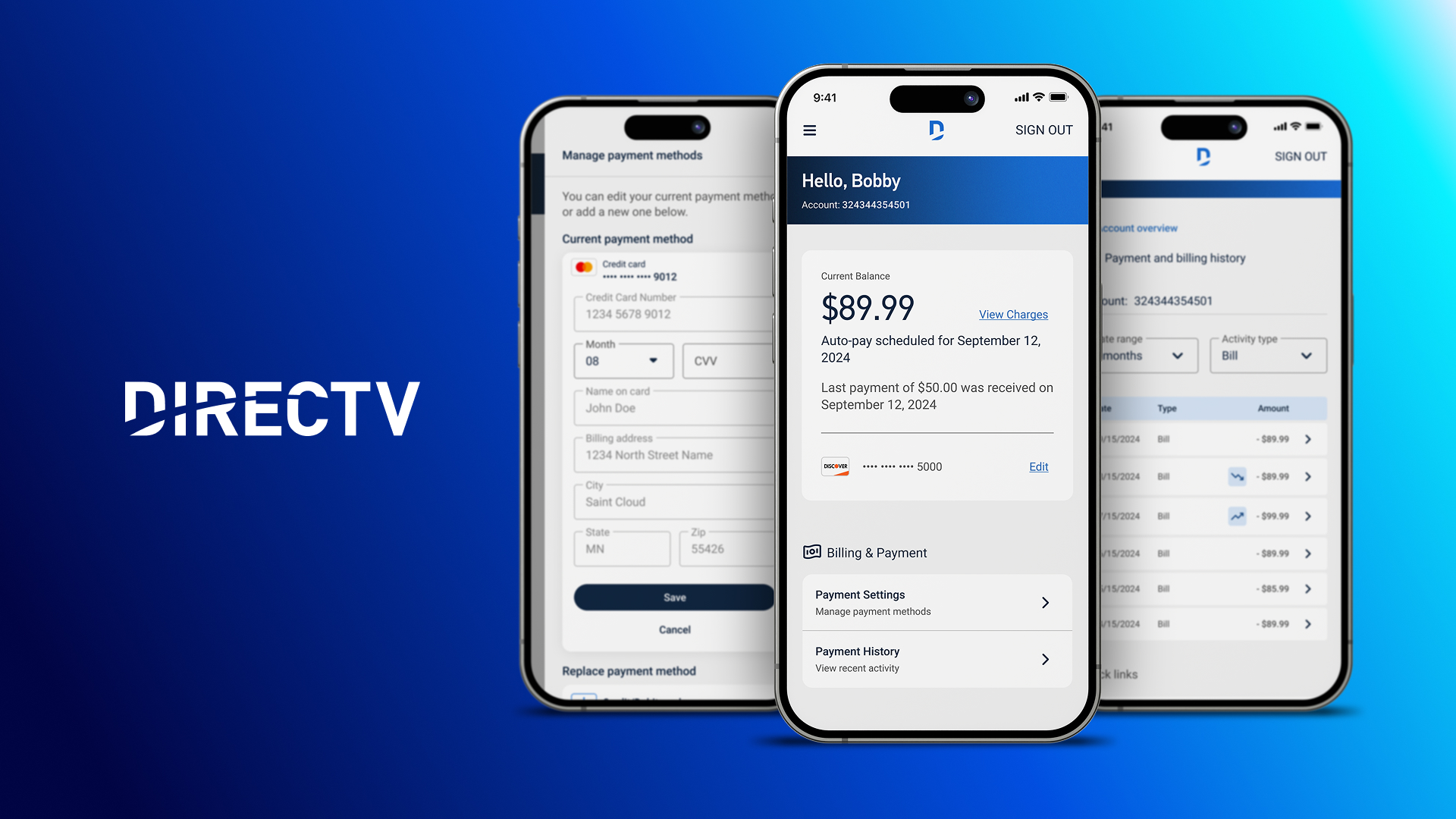
DIRECTVProduct Design
K Hovnanian HomesDigital Transformation

NAGASEDigital Transformation

T. Rowe PriceAEM Design System

PrinovaDigital Transformation

Cisco | GSXProduct Design

Cisco | Security & TrustEmployee Communications Campaign
Charles SchwabEvent Marketing

Bill.comProduct Launch & Branding

ViewpostIdentity & Product Design

Feeding AmericaAnnual Report

SEMISocial Media Campaign
Twin Cities MarathonIdentity & Event Marketing
Other WorkVarious

© Copyright 2023 David A. Molanphy. All Rights Reserved.