Other Work
Sometimes, a project is too small to merit an entire page to showcase it. Other times, an idea comes to life but it doesn't make the cut. The work below represents a small selection of designs and ideas that I’m proud of for one reason or another.
Other Work
Not every project is large enough to fill an entire page worth of photos, and not every concept presented gets chosen. This is a small selection of projects (or concepts) I’m proud of for one reason or another.
Logos
I have designed a number of identities over the years—some for clients and businesses, and some for family and friends. Regardless of where the commission comes from, it is always a rewarding challenge.

Hancock Whitney Bank
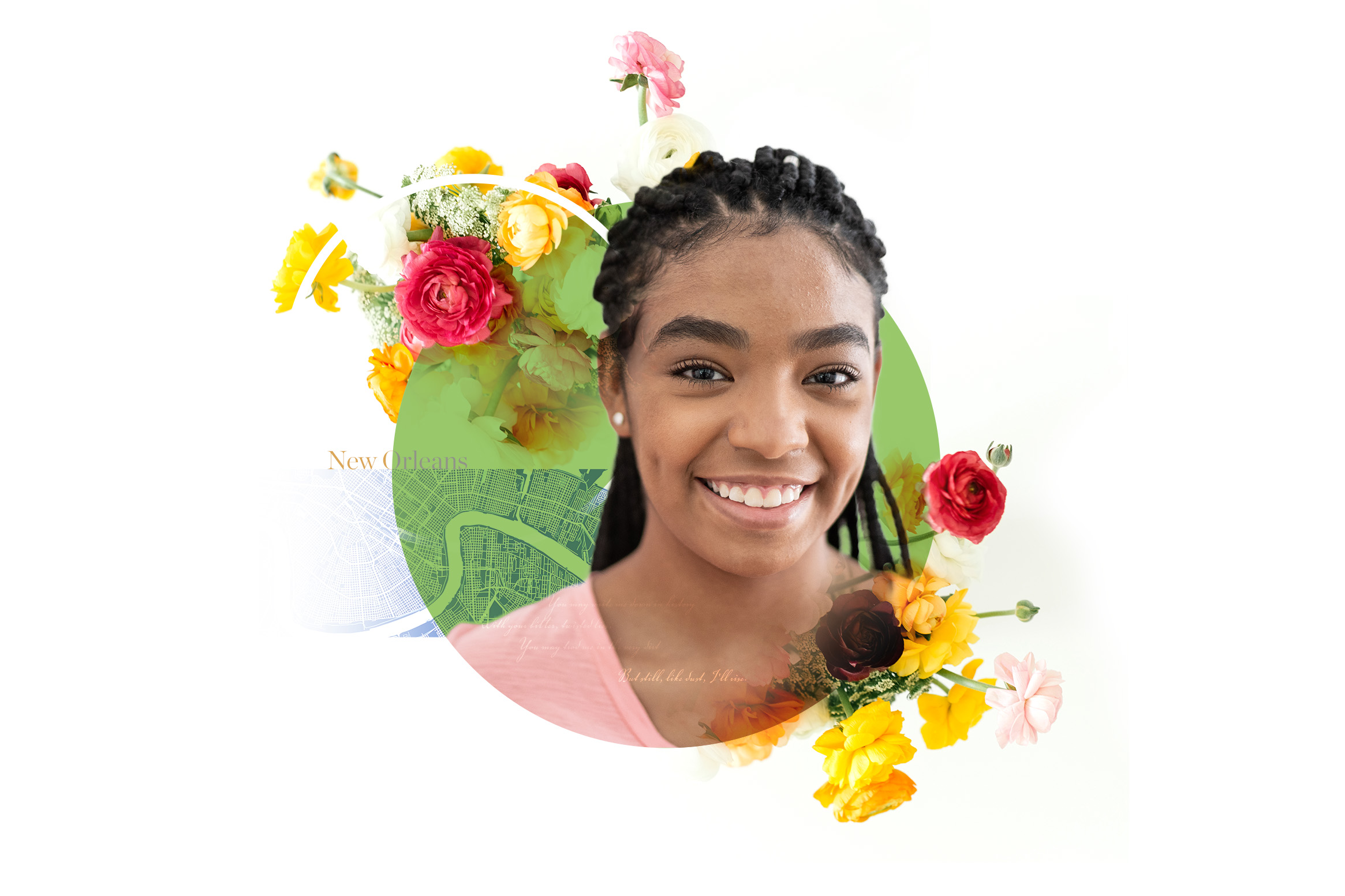
I designed these colorful vignettes to represent vibrant minority communities in Baton Rouge. While the images were fun to create, the concept for the campaing shifted to a more serious tone so these had to go.




SanDisk
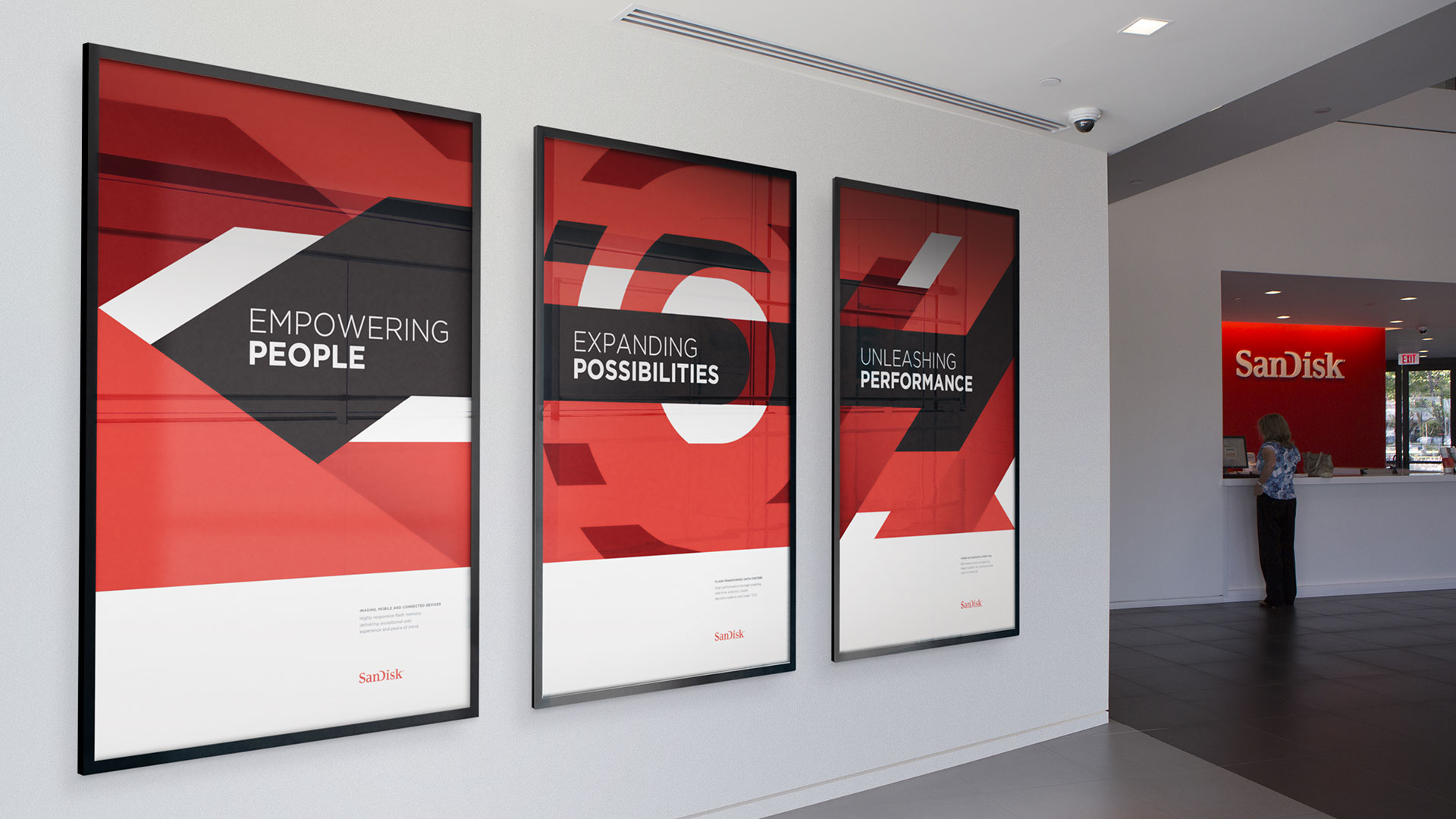
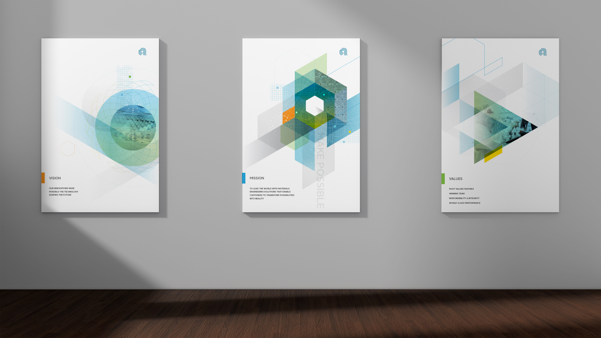
These poster concepts were part of an internal campaign to better communicate the company’s vision, mission, and values to its employees. The concept was deemed too abstract and a more photographic approach was chosen in the end.
Sephora
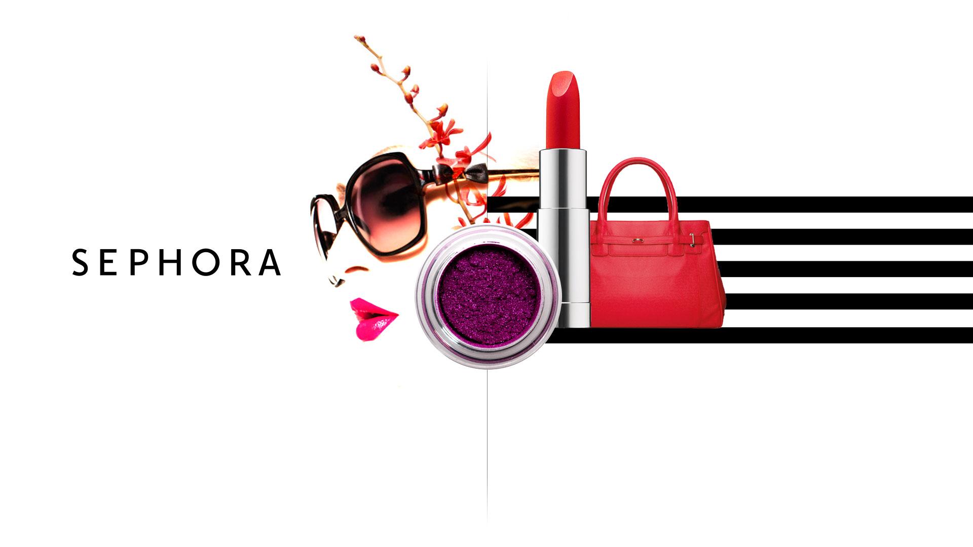
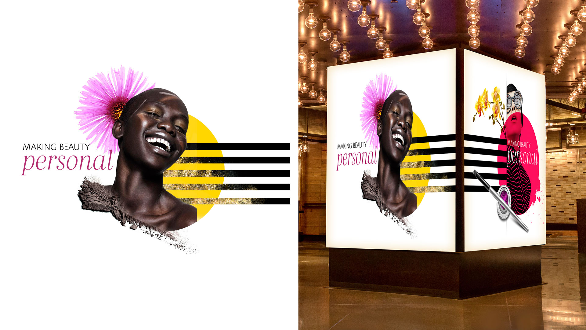
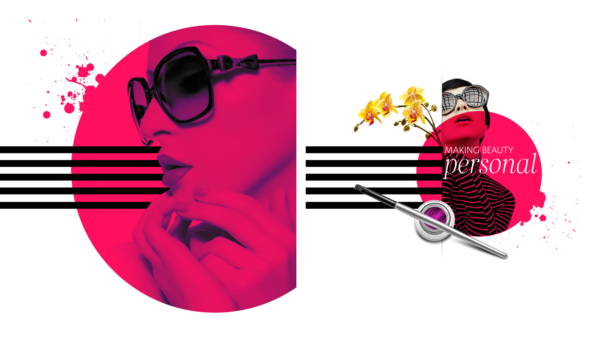
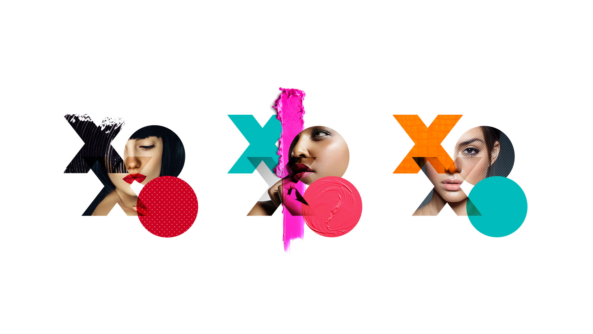
Every year, Sephora gathers employees from stores and HQ in their largest event of the year—the Store Leadership Conference (SLC). These theming concepts focused on highlighting that beauty comes from within.
Guide Monkey
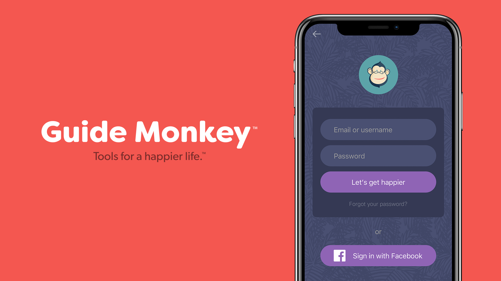
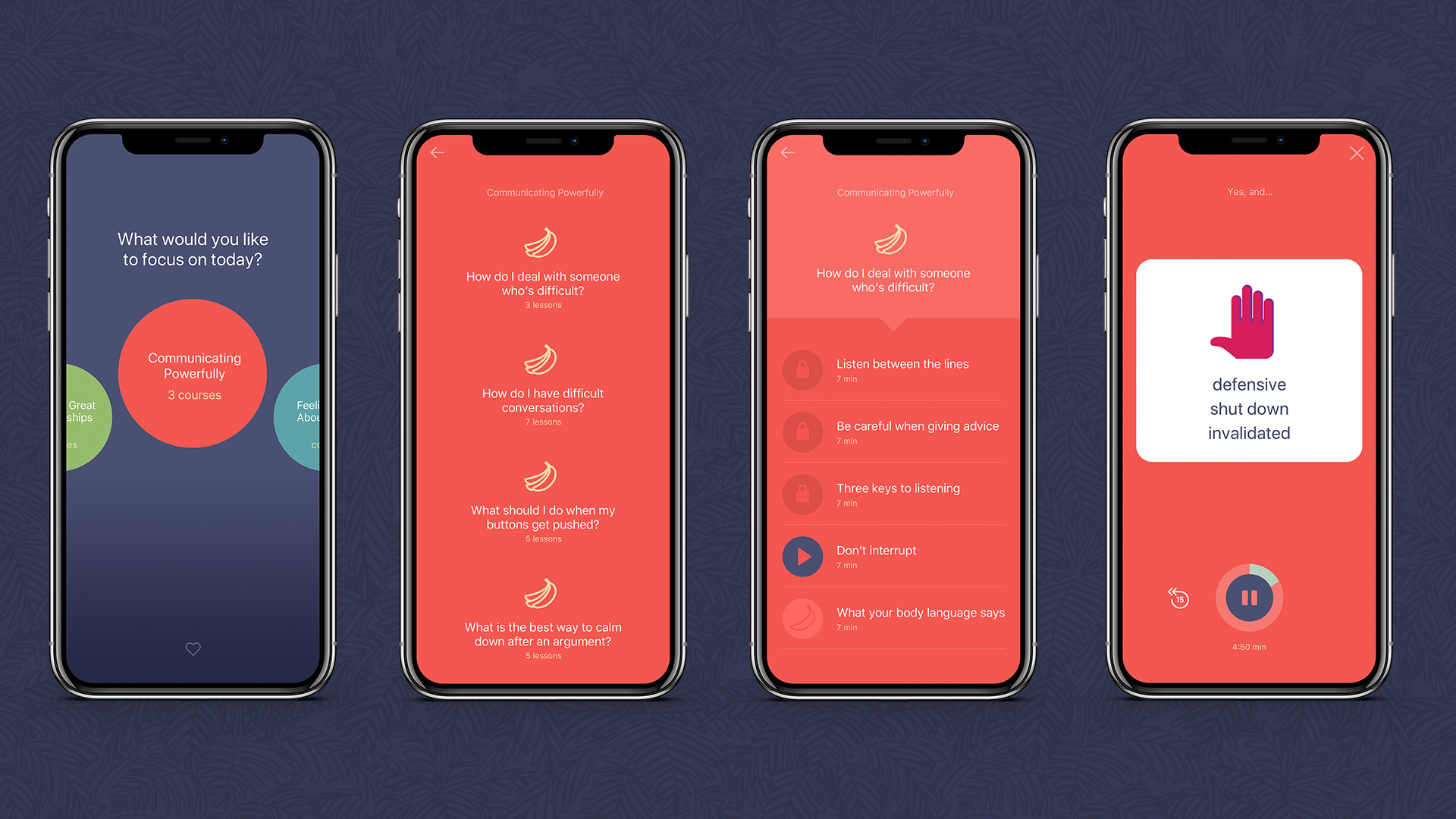
An identity and UX/UI for an emotional wellness app aimed at educating people on how to solve their day-to-day problems. The objective was to make the app feel playful, approachable, and easy to engage with.
AIGA
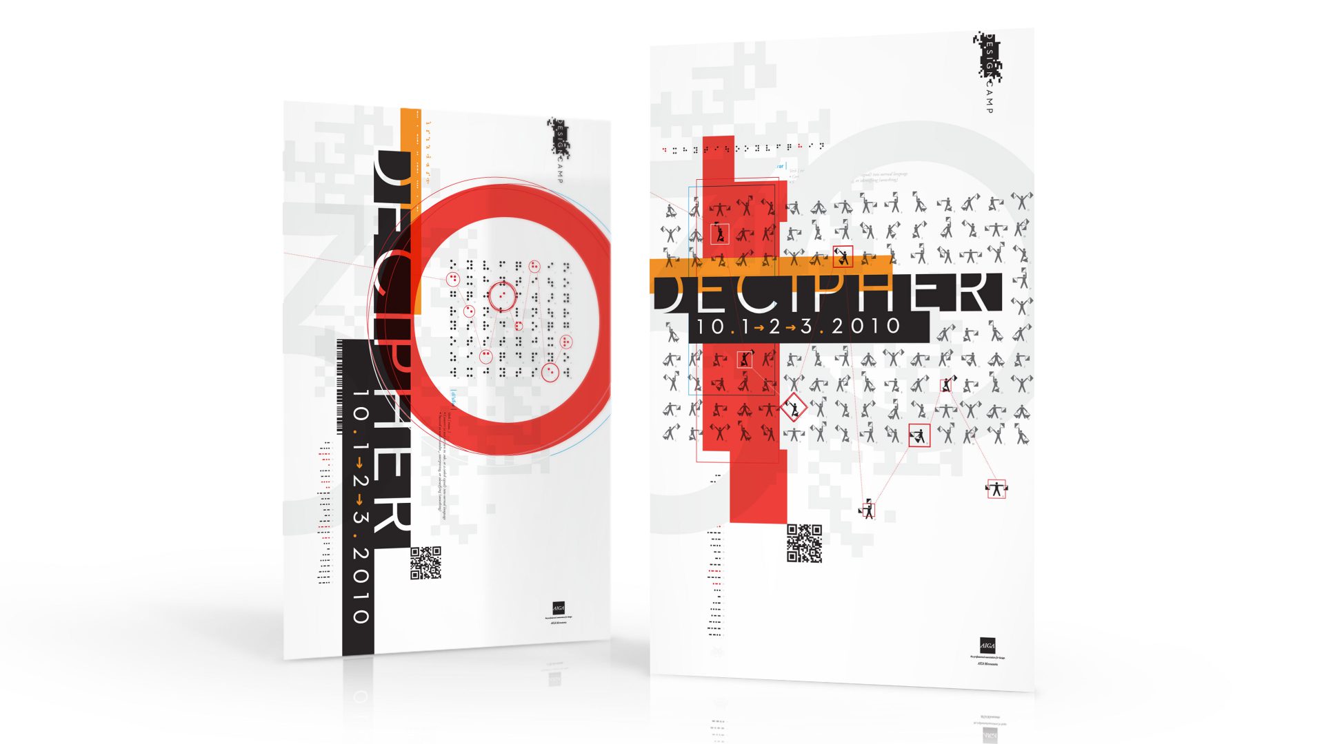
Design Camp is AIGA MN’s flagship event, and the theme for 2010 was how a designer’s job is often to decipher the best solution to a business need. These posters employed multiple ciphering techniques to hide a message for a prize drawing. The concept, while visually interesting, was too disconnected from the event’s beer drinking brand. Despite that, it remains as one of my favorite pieces.
Kateeva
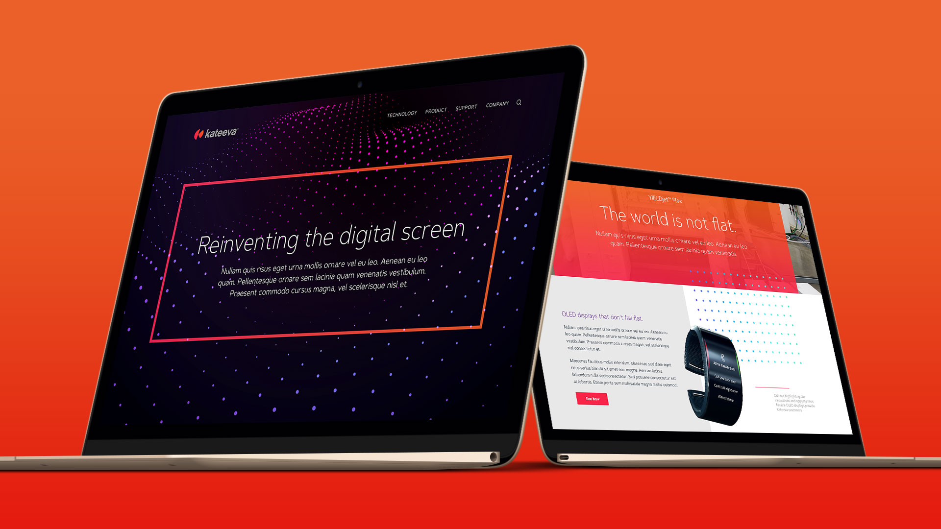
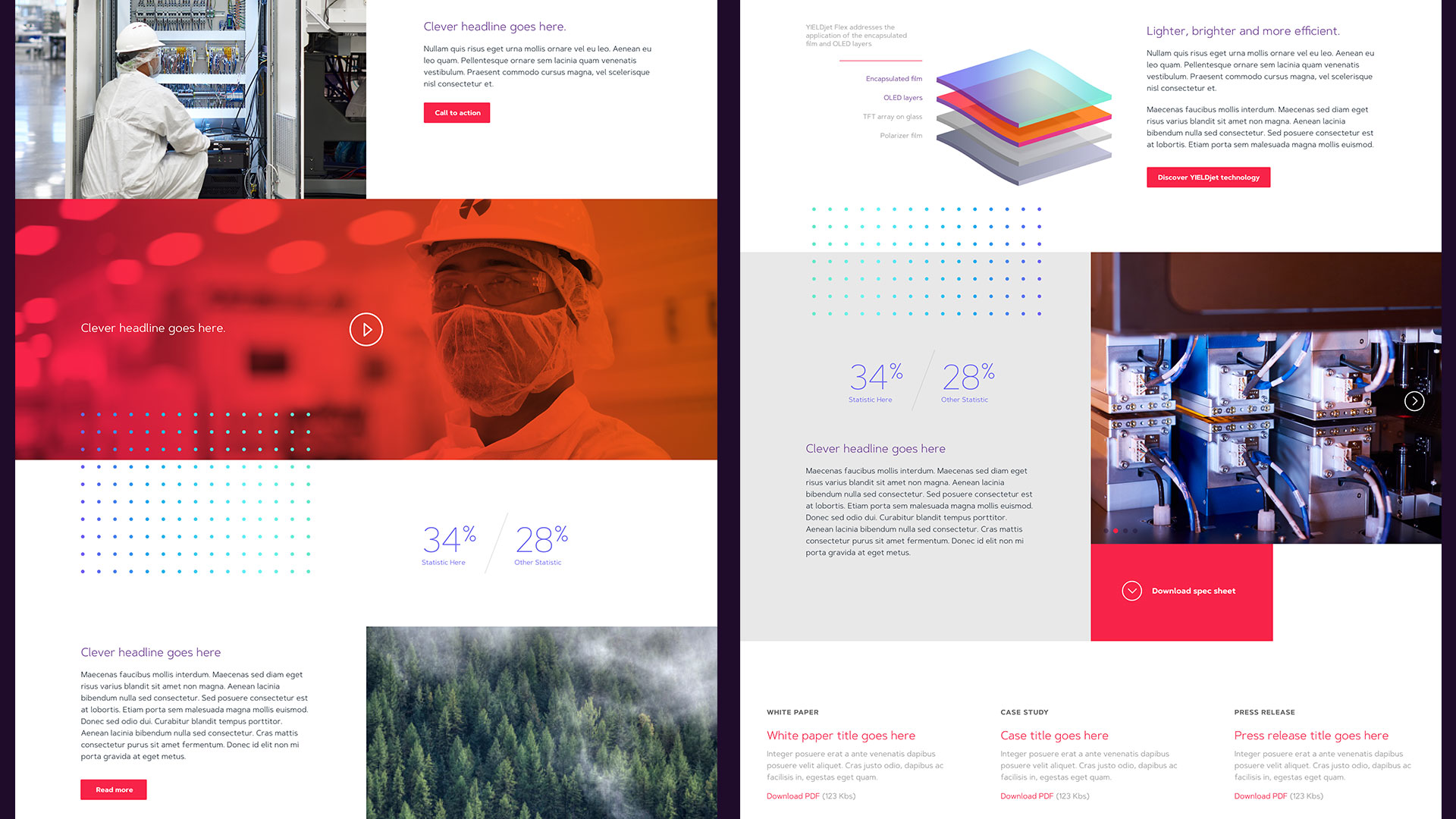
Kateeva is one of those companies you don’t really hear about, but is disrupting an entire industry. To put it simply, they make flexible OLED displays possible (think rollable TVs) using inkjet printing technology. This early website concept used an animated dot wave and dot patterns to illustrate their innovative approach. Parts of this original concept survived in the final design.
Applied Materials
This set of posters was a abstraction of Applied Materials' corporate Vision, Mission and Values. The first poster uses a circular theme to represent vision. The middle poster is meant to be a target (mission), and the third poster represents forward momentum (values).

Hancock Whitney BankBrand Awareness Campaign
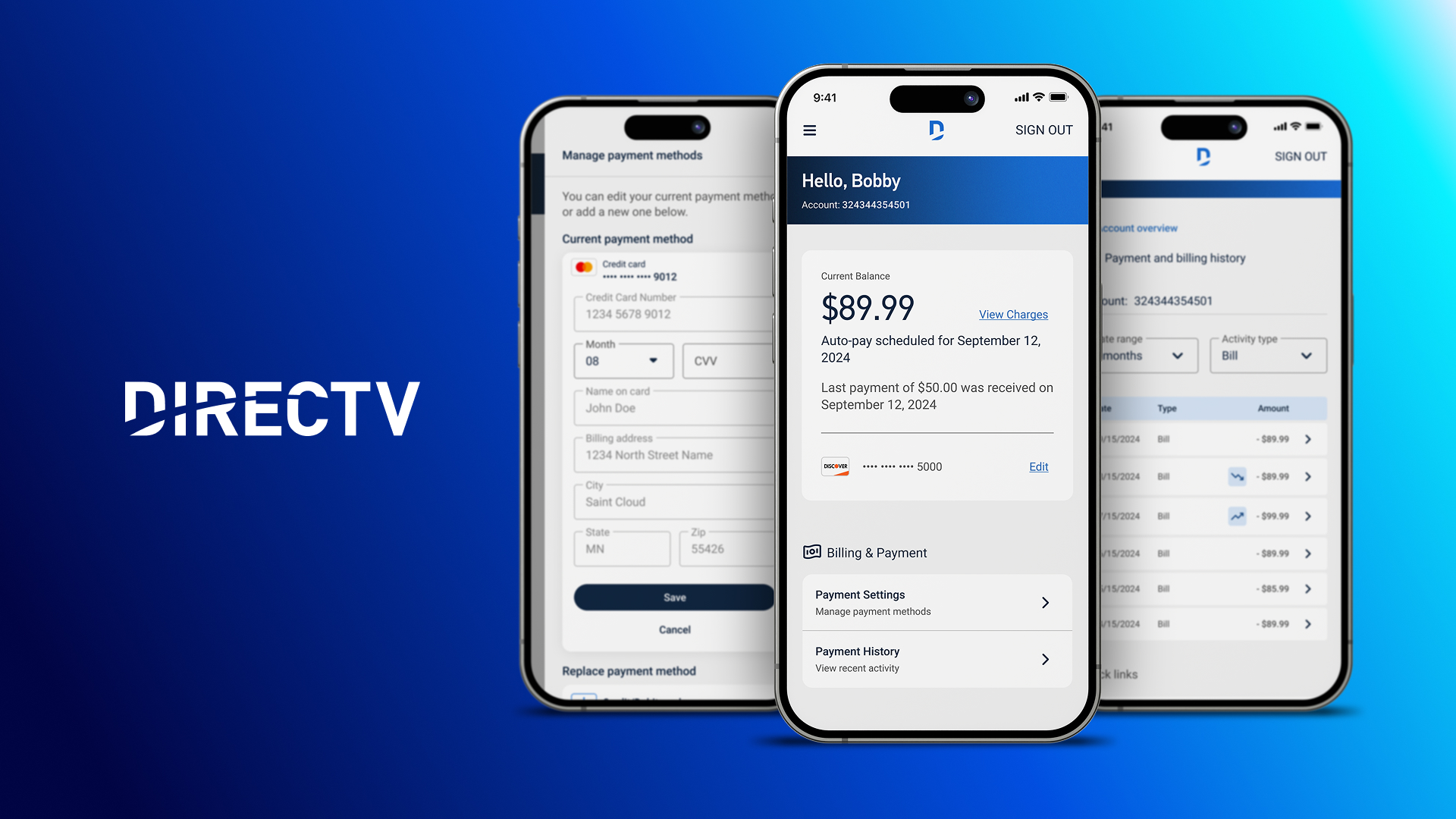
DIRECTVProduct Design
K Hovnanian HomesDigital Transformation

NAGASEDigital Transformation

T. Rowe PriceAEM Design System

PrinovaDigital Transformation
Cisco | GSXProduct Design
Cisco | Security & TrustEmployee Communications Campaign
Charles SchwabEvent Marketing

Bill.comProduct Launch & Branding
ViewpostIdentity & Product Design

Feeding AmericaAnnual Report
SEMISocial Media Campaign
Twin Cities MarathonIdentity & Event Marketing
Other WorkVarious